Vibrant Hues Color the Lightcatcher for One More Week
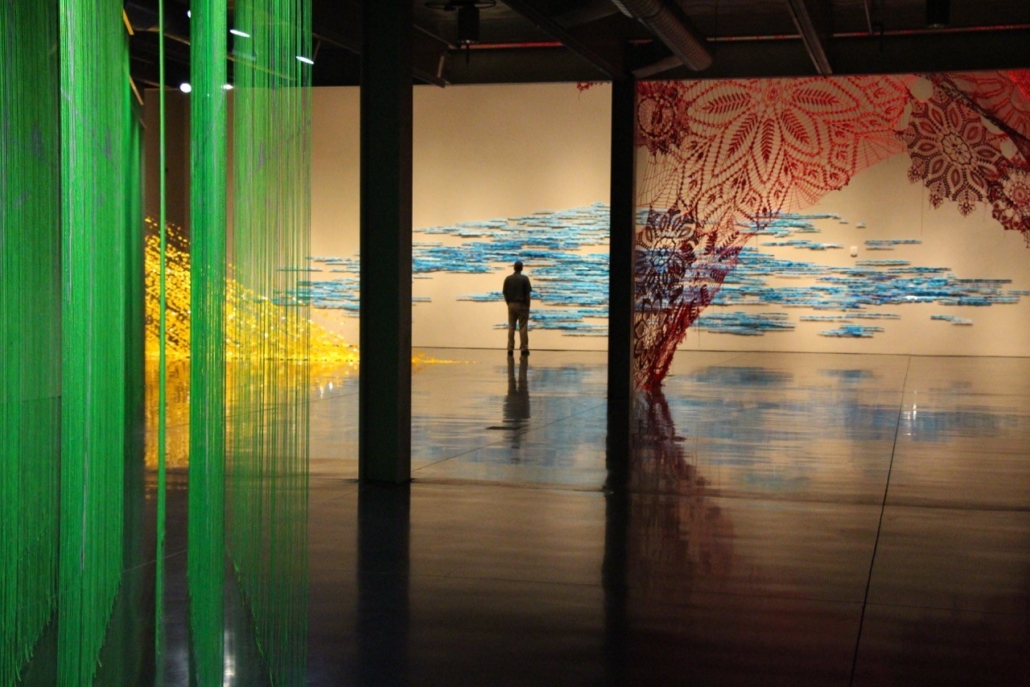
Katy Stone & Ashley Blalock installations in the Colorfast exhibition. Photo by David Scherrer.
Essay excerpted from Colorfast: Vivid Installations Make Their Mark exhibition catalog by guest curator Amy Chaloupka. The exhibition closes Sept. 18, 2016.
Artists Ashley V. Blalock (California), Elizabeth R. Gahan (Washington), Damien Gilley (Oregon), and Katy Stone (Washington) understand the elemental impact of color and wield it in their work with striking effect for the exhibition Colorfast: Vivid Installations Make Their Mark. These artists visited the Whatcom Museum’s Lightcatcher building throughout the year to develop their design concepts in relationship to the architectural spaces of the building. Using a variety of media and processes, the four artists in this exhibition express how color and improvisation fuse with intuitive response and open space.
Ashley V. Blalock injects the color red, along with the many complex suggestions this color conjures, into her sweeping installation Keeping up Appearances. The image of crocheted doilies bring to mind the dainty white home coverings found draped over the surfaces of antique furniture. They are something quite different to see at the scale of more than 16 feet, in the shade of bright crimson, stretched and looming overhead. Doilies become roiling, devouring tunnels that no longer allude to grandmother’s living room. Blalock successfully takes the doily away from home to suggest that sometimes objects of display and comfort serve as thin veneers covering harsher truths.
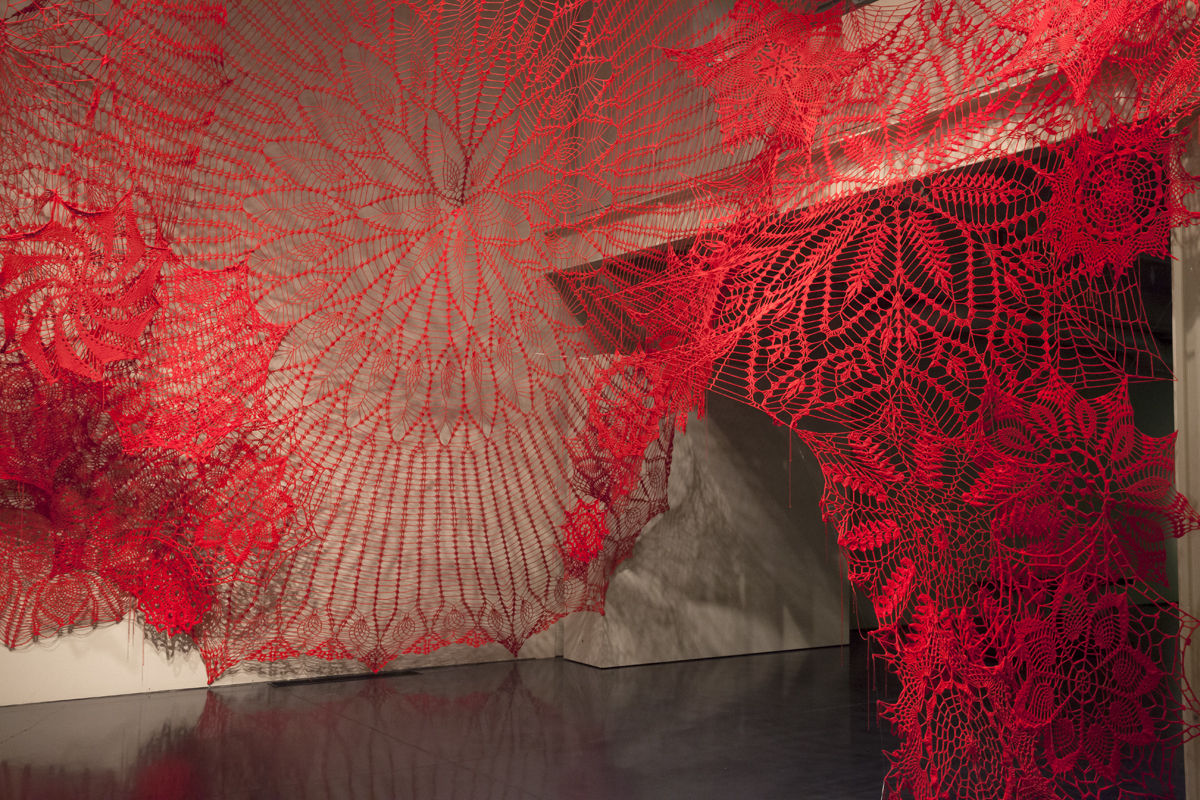
Ashley V. Blalock, Keeping Up Appearances; Yarn. Photo by David Scherrer.
Elizabeth R. Gahan incorporates aspects of graphic design and advertising into her pieces, Chromatic Crystallization and Crystallized Growth II. Utilizing industrial or recycled materials, she locates her installations on building exteriors and scales them to the size of billboards or promotional signs. Instead of directing her message to sell a product, her work takes the shape of organic, crystalline growths that appear to multiply and take over the structures that they inhabit.

Elizabeth R. Gahan, Seattle, Wash., Crystallized Growth II; Corrugated plastic and vinyl. Courtesy of the artist. Photo by Amy Chaloupka.
What happens when our sense of sight deceives us, and the diagrams that we rely upon dissolve before our eyes? Damien Gilley explores this destabilizing effect through his installation, Event Horizon. The synthetic, vibrant, neon-green strands of his installation appear electrically charged and illuminated from within, recalling the flickering glow of early computer screens. The visual vibration stimulated by the glow of the color leads to spatial confusion. The artist creates a realm to lose oneself in rather than to find the correct path.

Damien Gilley, Event Horizon; Nylon and paint. Photo by David Scherrer.
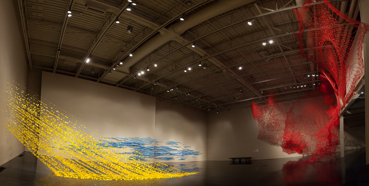
While Blalock, Gahan, and Gilley primarily examine color and its relationship to built environments, Katy Stone looks to the colors of nature. The artist mimics the composition and angle of rays of light with the co-mingling of clouds and water along the horizon line. However, in the same way that memory amplifies and exaggerates events from the past, she injects tones of pulsating yellow and rich gradients of blue into white that surpass the saturation and intensity of these colors in any natural setting. Stone interprets the expressive power of color as a primary mode of communication.
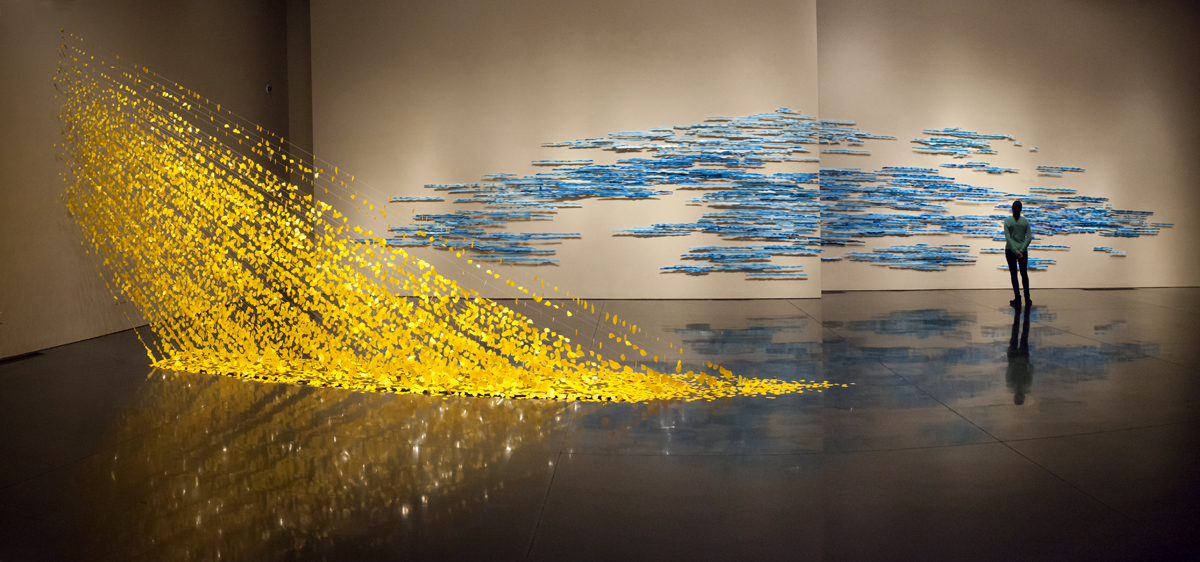
Katy Stone’s installations, Ray and Horizon; Acrylic on Duralar, string, pins. Photo by David Scherrer.
The artists in Colorfast mine the depths of color’s seemingly endless interpretations and allusions, proving that color is more than an applied surface treatment and integral to the meaning of the work. This display will exist for a short time, integrated within a particular space, and then, thereafter only colored by memory. See it before it closes, Sun., Sept. 17, 2016 in the first floor galleries of the Lightcatcher building, 250 Flora Street.


Leave a Reply
Want to join the discussion?Feel free to contribute!